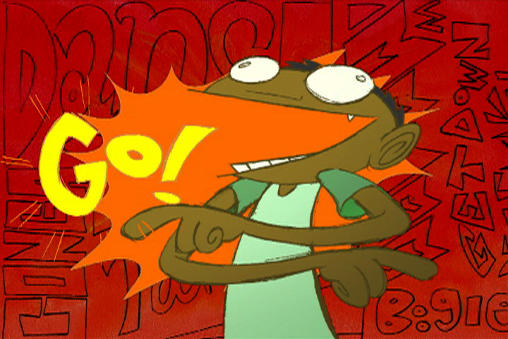
But let's be honest. That would look terrible. I hate when marketing people repurpose screenshots instead of making new artwork, and I drew that picture a year ago. So I did a new one:

-------------------------
EDIT: I think I should mention(cause it's weird), that the inking style is inspired by Looney Tunes Licensing art. I notice this sort of thing because I'm a huge nerd, but bear with me here. For the longest time, Looney Tunes artwork was really really crappy, over-simplified versions of Chuck Jones model sheets wearing basketball jerseys or whatever. UGH. Recently though, they've been making new poses based on Bob Clampett's designs, and they look fantastic. My goal with the above piece was to create some "corporate" cartoon art, so I decided to copy them. Here's what I mean:
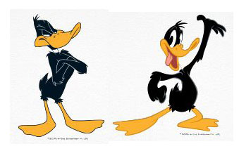
Neither of these are quite the epitome of cartoon art, but any shmoe on the street could identify the Daffy on the right as more appealing.
Plus, Clampett's Daffy is just plain old superior to Jones' Daffy. but I guess that's a nerd rant for another time.


3 comments:
Why don't you ever dance like this around the studio?
Great steel... Best regards...
You know, I was going to say something about there being a resemblance in style to Looney Tunes, and I didn't. I am doomed to regret this, probably forever.
Post a Comment